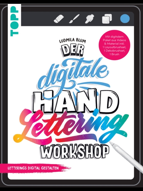
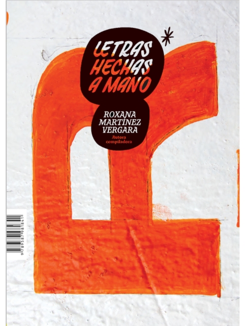
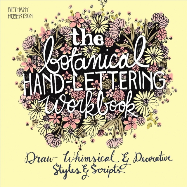
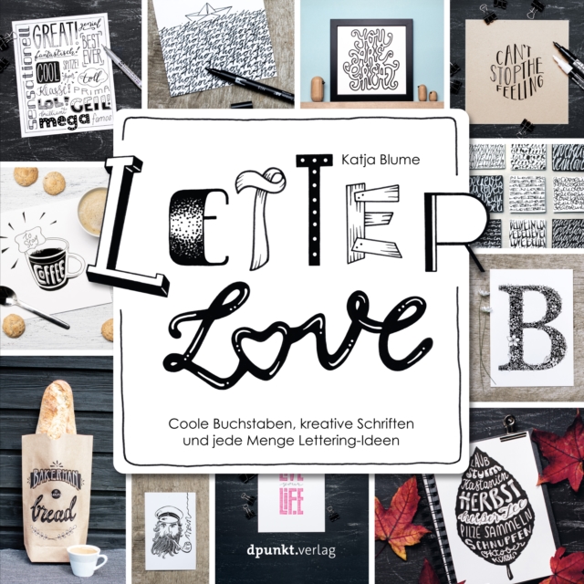
By breaking down the study of type into a systematic progression of relationships-letter, word, sentence, paragraph, page, and screen-award-winning graphic designer and professor of communication design Denise Bosler provides a unique and illuminating perspective on typography, for both print and digital media, and for designers of all skill levels.
Editorial Design presents designers with everything they need to know to create their own layouts, connecting editorial design history with current practice to enlighten and inspire the beginner as well as the more experienced designer.
Plongez-vous dans l'histoire riche et mystérieuse des geishas avec notre dernier livre : "L'histoire des geishas au Japon - Une excursion à travers l'histoire culturelle du Japon".
By breaking down the study of type into a systematic progression of relationships-letter, word, sentence, paragraph, page, and screen-award-winning graphic designer and professor of communication design Denise Bosler provides a unique and illuminating perspective on typography, for both print and digital media, and for designers of all skill levels.
Sehr geehrte Leserinnen und Leser, ich freue mich, Ihnen nach nunmehr zwei Jahren der Recherche und Vorarbeit mein neues Buch über die japanische Handwerkskunst vorstellen zu können.
Profundamente revisada y ampliada, esta segunda edición de Pensar con tipos nos proporciona docenas de nuevas fuentes, ejemplos, ejercicios, ideas y consejos, además de una revisión y actualización exhaustiva de cada detalle.
Anxieties about the fate of reading in the digital age reveal how deeply our views of the moral and intellectual benefits of reading are tied to print.
Abschriften und Kopien bringen eine spezifische Ästhetik hervor, die bislang im Schatten einer Ästhetik des ›Originals‹ stand und als entweder redundant oder als vernachlässigbar galt.
In 1948, the world-renowned book designer Bruce Rogers wrote a brief text that documented and illustrated his creation of the Centaur typeface several decades earlier: The Centaur Types.
Las letras que dejan ver la mano de quien las escribe o las dibuja, entendidas como el medio que da forma a nuestra voz y a la de otros, son la esencia de este libro.
With Special Effects Lettering and Calligraphy, you'll learn to master a variety of lettering styles and gorgeous mediums to create amazing lettered art.
En esta segunda entrega de Cuadernos tipográficos se generan cuatro ejes discursivos: "Letras y contexto", "Forma, diseño y representación", "Enseñanza en tipografía" y "Tipografía y usos".
Este Manual de tipografía es una introducción a todo lo que cualquier estudiante o profesional del diseño gráfico debe saber sobre tipografía para desarrollar una sensibilidad y unos conocimientos tipográficos bien fundamentados.
Con una amplísima selección de ejemplos el siglo XX -desde el folleto de Jan Tschichold para Die Neue Typographie y los carteles de la Bauhaus hasta los catálogos de Nike-, Sistemas reticulares: principios para organizar la tipografía ofrece una panorámica de las retículas variada y fácil de comprender, desde una perspectiva basada en el aprendizaje de la composición tipográfica paso a paso.
This illustrated history of hand-lettered painted signs across America, and the craftspeople who created them, is"e;a lovely paean to a vanishing art"e; (TheNew York Times).
Having procured a cult-like following in the modern field of design, this extraordinary volume is brimming with over 100 intricate typeface examples, all skilfully produced and vibrantly coloured.
William Morris was born in Walthamstow, London on 24th March 1834 he is regarded today as a foremost poet, writer, textile designer, artist and libertarian.