This book offers a considered voice on the advertising chaos that colours our rapidly changing media environment in a world of fake news, fast facts and seriously depleted attention stamina.
This book is a collection of chapters penned by practitioners from around the world on the impact that disinformation and fake news has had in both the online and social sphere.
This book gathers new empirical findings fostering advances in the areas of digital and communication design, web, multimedia and motion design, graphic design, branding, and related ones.
BECOME A MASTER AT NEGOTIATION AND COMMUNICATIONNever go into an important conversation feeling unheard, unprepared, or uninformed againapply the proven SISCO method for communication to become a master negotiator, trusted interviewer, and engaging conversationalist.
This book addresses the hot topic in audiovisual translation (AVT) of video game localization through the unique perspective of dubbing, an area which has so far received relatively little scholarly focus.
This book includes the proceedings of the third workshop on recommender systems in fashion and retail (2021), and it aims to present a state-of-the-art view of the advancements within the field of recommendation systems with focused application to e-commerce, retail, and fashion by presenting readers with chapters covering contributions from academic as well as industrial researchers active within this emerging new field.
In this book, a solid and emerging group of international researchers contributes to the theory of metadiscourse and to our understanding of the role metadiscourse and related 'meta' phenomena may play in digital forms of communication.
Digitale Selbstvermessungsangebote wie Schrittzähler, Ernährungs-Apps oder Sport-Tracker machen den Körper als Objekt von Daten, Zahlen oder Graphen sichtbar.
Hay un hilo secreto que conecta las pinturas rupestres de la cueva de Altamira, los bestiarios medievales, las campañas de reclutamiento de soldados durante la Primera Guerra Mundial, los posters psicodélicos de los conciertos de rock, las tapas de las revistas de moda, la apropiación de productos de consumo en obras del arte pop y la irrupción de las nuevas tecnologías en la vida cotidiana.
CUANDO EL ROCK SE ENCUENTRA CON EL ARTEEste libro, el primero en profundizar de manera nueva y cautivadora en todas las relaciones entre el rock y las distintas formas de arte, está dividido en ocho secciones: carátulas, pósteres, artistas y diseñadores, fotografía, objetos, cine, moda.
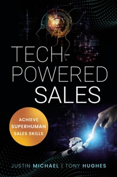
Josiane Feigon, author and pioneer of the inside sales community, recognizes that the pressure to produce can be crushing, but the guidance provided thus far has been minimal.
Mark Donnolo applies years of firsthand knowledge as a leading sales consultant for Fortune 500 companies to address the tough questions leaders should be asking.
From amidst the clutter of lead generation tactics, this strategic guide teaches marketers how to make the many available lead generation tactics work together to produce the maximum number of quality leads.
This book is a collection of eleven articles, written by leading experts and dealing with special topics in Multivariate Approximation and Interpolation.
Fractal geometry is a uniquely fascinating area of mathematics, exhibited in a range of shapes that exist in the natural world, from a simple broccoli floret to a majestic mountain range.
This book offers an original new conception of visual story telling, proposing that drawing, depictive drawing and narrative drawing are produced in an encompassing dialogic system of embodied social behavior.
This book explores issues at the intersection of communication and African electoral politics, taking Ghana's 2020 general election as a focus of investigation.
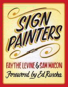
This illustrated history of hand-lettered painted signs across America, and the craftspeople who created them, is"e;a lovely paean to a vanishing art"e; (TheNew York Times).
It's everywhere, including the moon (on the commemorative plaque left by Apollo 11 astronauts), Nike sneakers, the artworks of Barbara Kruger, Ed Ruscha, and Jenny Holzer, 2001: A Space Odyssey credits, Domino's Pizza boxes, Absolut Vodka bottles, and Red Bull cans.
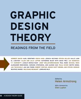
Graphic Design Theory is organized in three sections: "e;Creating the Field"e; traces the evolution of graphic design over the course of the early 1900s, including influential avant-garde ideas of futurism, constructivism, and the Bauhaus; "e;Building on Success"e; covers the mid- to late twentieth century and considers the International Style, modernism, and postmodernism; and "e;Mapping the Future"e; opens at the end of the last century and includes current discussions on legibility, social responsibility, and new media.
A powerful reminder to anyone who thinks design is primarily a visual pursuit, The Senses accompanies a major exhibition at the Cooper-Hewitt Smithsonian Design Museum that explores how space, materials, sound, and light affect the mind and body.
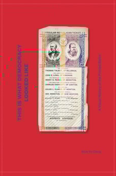
This Is What Democracy Looked Like, the first illustrated history of printed ballot design, illuminates the noble but often flawed process at the heart of our democracy.
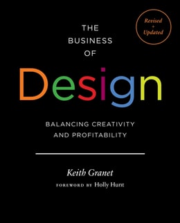
The Business of Design debunks the myth that business sense and creative talent are mutually exclusive, showing design professionals that they can pursue their passion and turn a profit.
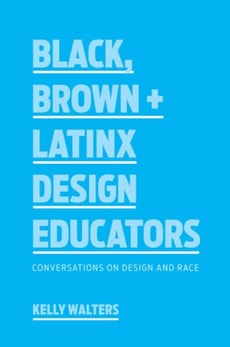
In Black, Brown + Latinx Design Educators, Kelly Walters collects twelve deeply personal interviews with graphic design educators of color who teach at colleges and universities across the United States and Canada.
This book brings together fresh evidence and new theoretical frameworks in a unique analysis of the increasing role of social media in political campaigns and electoral processes across Africa.
This book explores the emerging trends and patterns in online student evaluations of teaching and how online reviews have transformed the teacher-student relationship as developments in technology have altered consumer behaviors.
In Chinese, the term wanghong refers to creators, social media entrepreneurs alternatively known as KOLs (key opinion leaders) and zhubo (showroom hosts), influencers and micro-celebrities.
This book explores how the rise of widely available digital technology impacts the way music is produced, distributed, promoted, and consumed, with a specific focus on the changing relationship between artists and audiences.
This book reports on research findings and practical lessons featuring advances in the areas of digital and interaction design, graphic design and branding, design education, society and communication in design practice, and related ones.
This book reports on interdisciplinary research and practices in communication, interior, fashion and product design, highlighting strategies for systematizing the design approach in a global, digital world.